LOGOTYPE
Ate That!

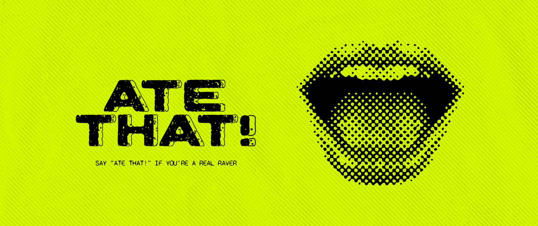
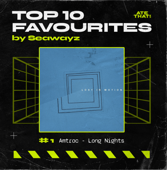
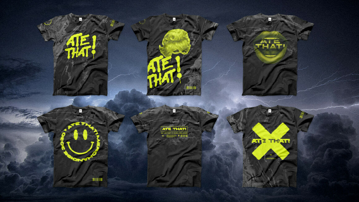
Ate that! was initially inspired by the UK underground club vibe. The record label has been operating in such genres as UK garage, electronic, and others. From the very beginning, its reflection found itself in acid green and black colours used in the official branding these days as well.


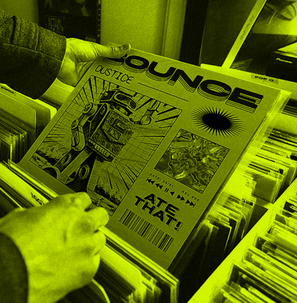
Authentic and with certain easter eggs to the cultural past - that was the goal in terms of the final general picture. We got our inspiration from the old vinyl collections and some fusion elements - that’s where scrapes and old-fashioned textures met modern lines and fonts. The label’s debut artist Dustice was completely wrapped up that way.
BRANDING
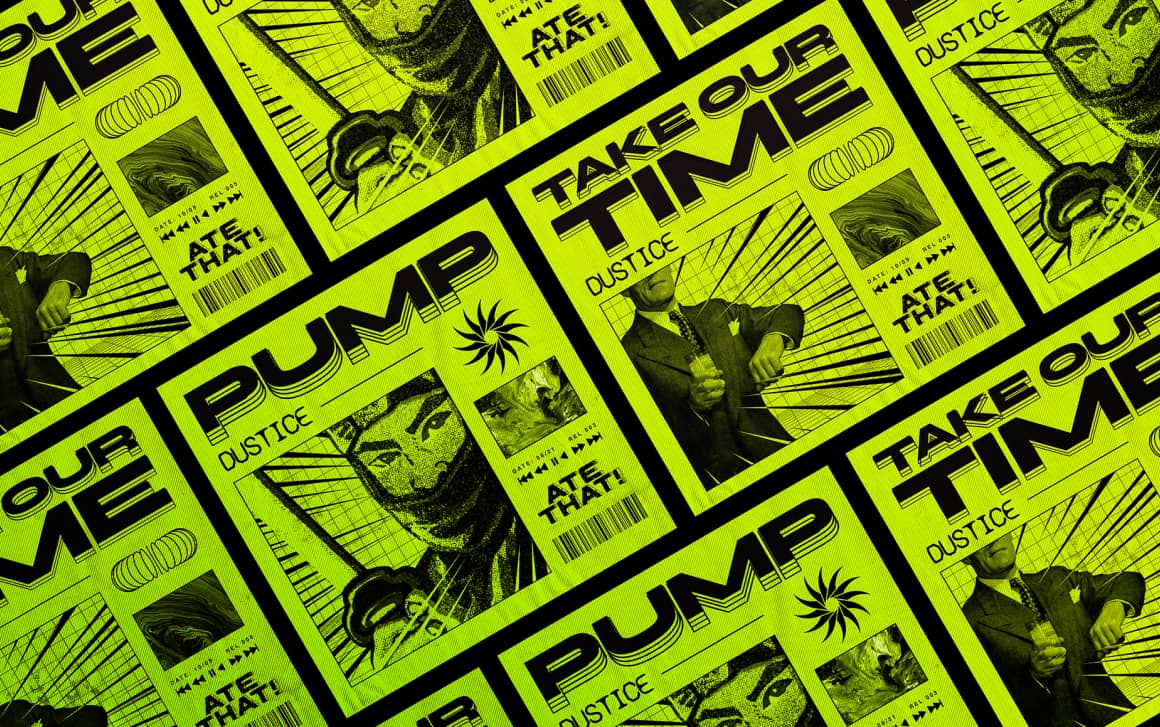
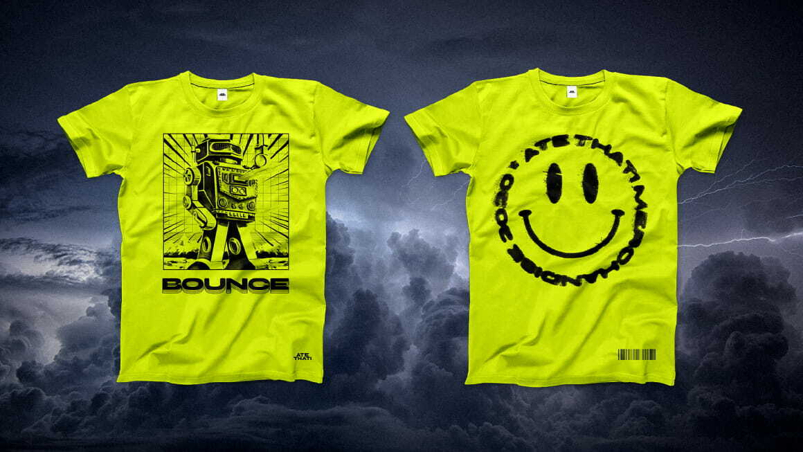
Soon after several first releases, we got down to elaborating the label’s merchandise design. It immediately collected positive feedback before even launching the production. A mixture of acid green, black and numerous flashbacks of the past label releases.
MERCH
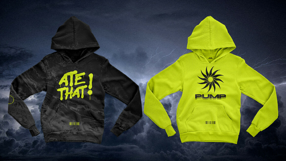
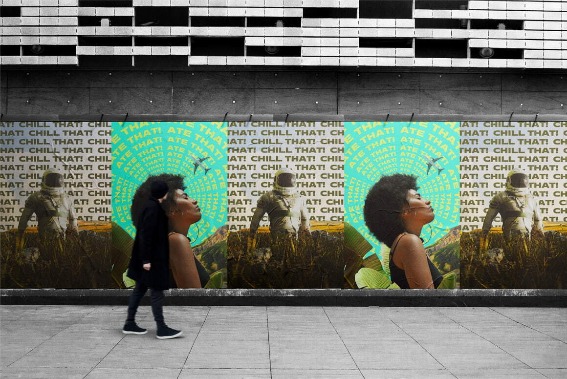
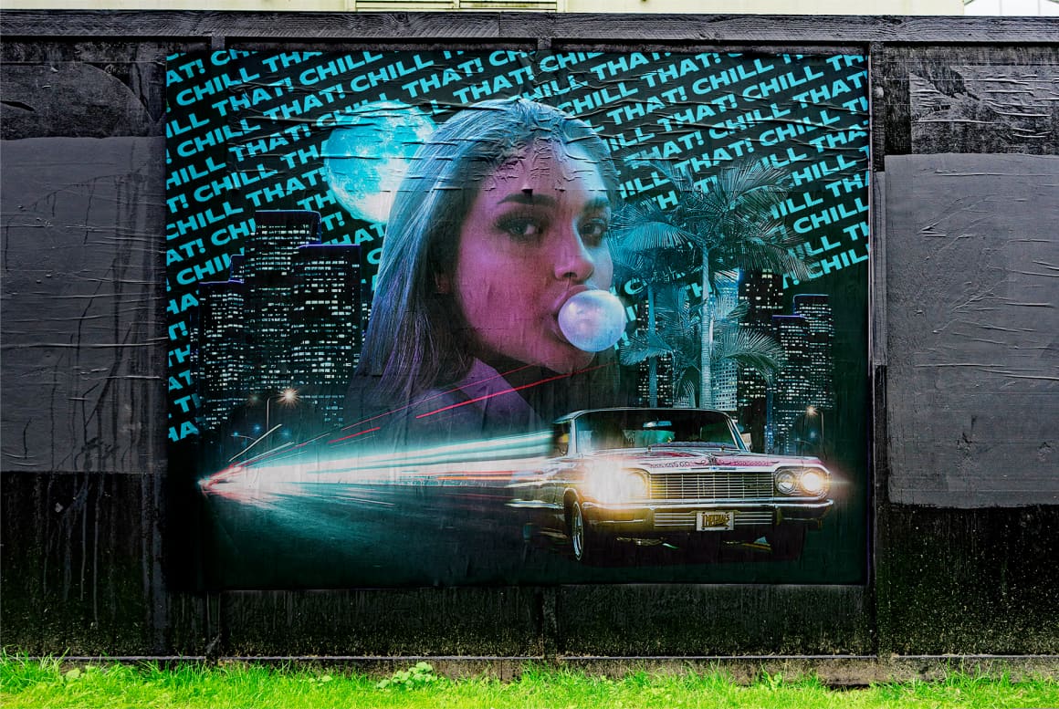
When the label started generating considerable numbers of streams, its structure developed into several new sub-labels, including chill that! with chillout and deep house music and gg that! with copyright-free music aimed at streamers. For each sub-label a new unique design was invented, along with a slight rebranding of the main label ate that!. Particularly, now each artwork, asset, animation or lyric video not only emphasises the label it belongs to but also reflects the mood of a track.
COVERS & ANIMATIONS