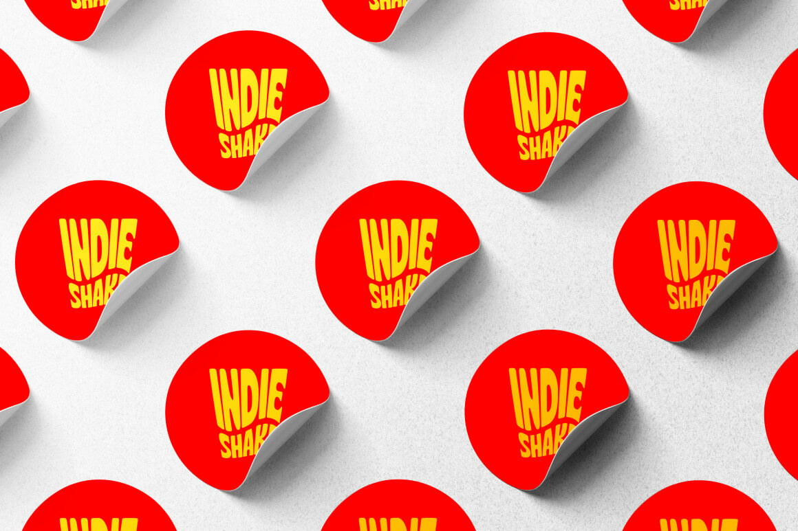
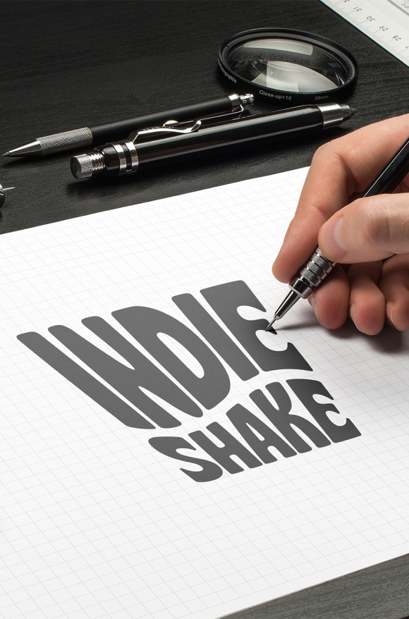
LOGOTYPE
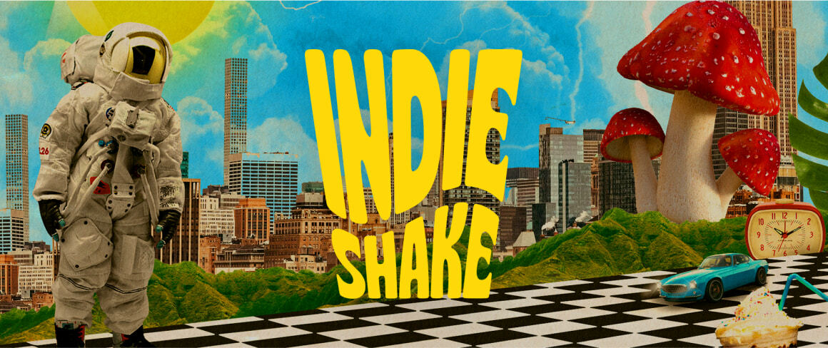
INDIESHAKE

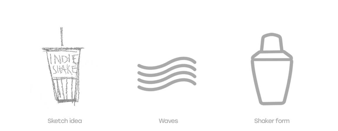
The concept of Indieshake was born out of the idea where milkshakes represent different genres with their flavours. Since the record label is made by artists for artists and strongly emphasises its independence, the “indie” part immediately made sense. Indieshake formed that picture of a shaker with wavy font and bright colours.


BRANDING
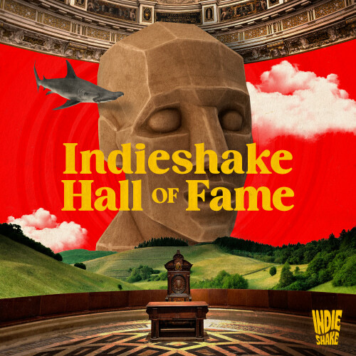
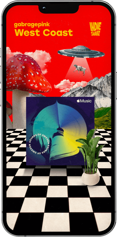
As we kept on developing the Indieshake branding, all bizarre elements started to pop up. The label sticks to the policy that it’s the place for all who are not like the others, and we knew straight away how to show that. Giant mushrooms, houseplants, flying animals and normal landscapes with not really normal lighting - we made sure reality collided with dreams.
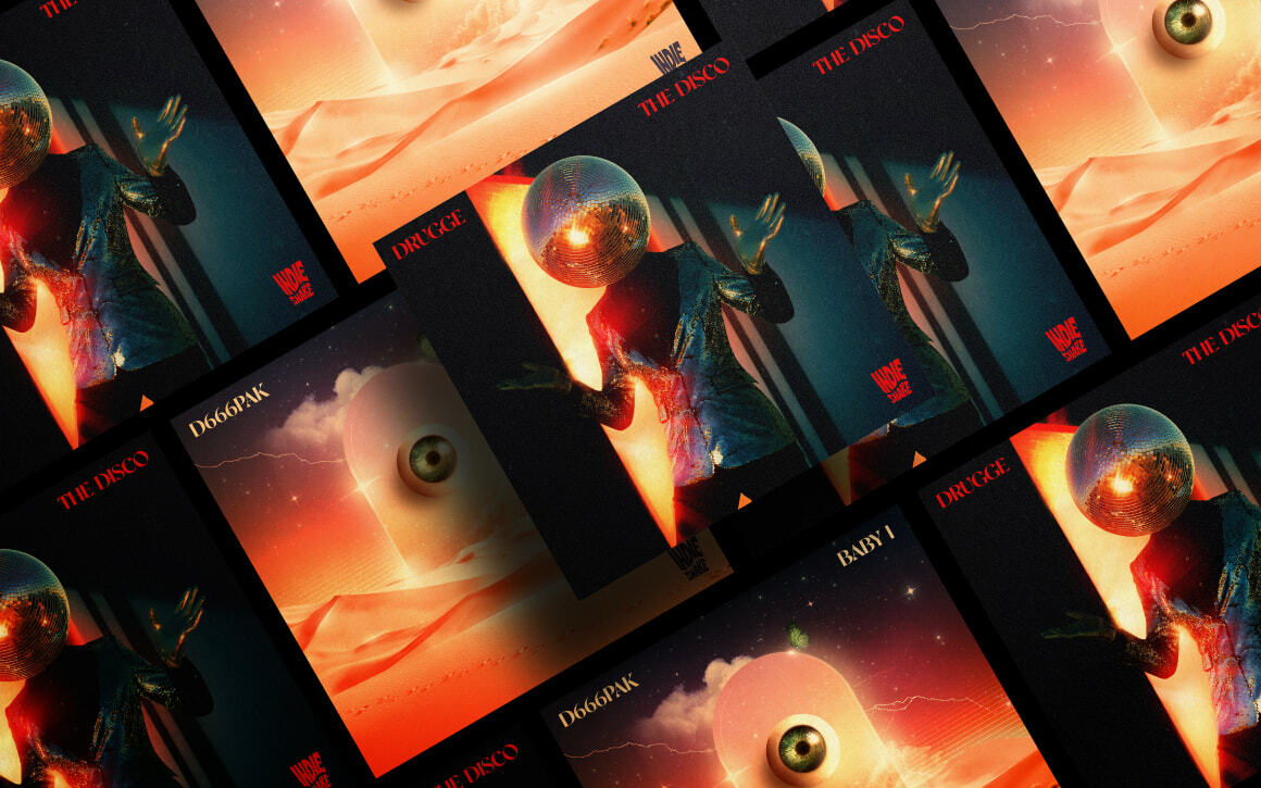
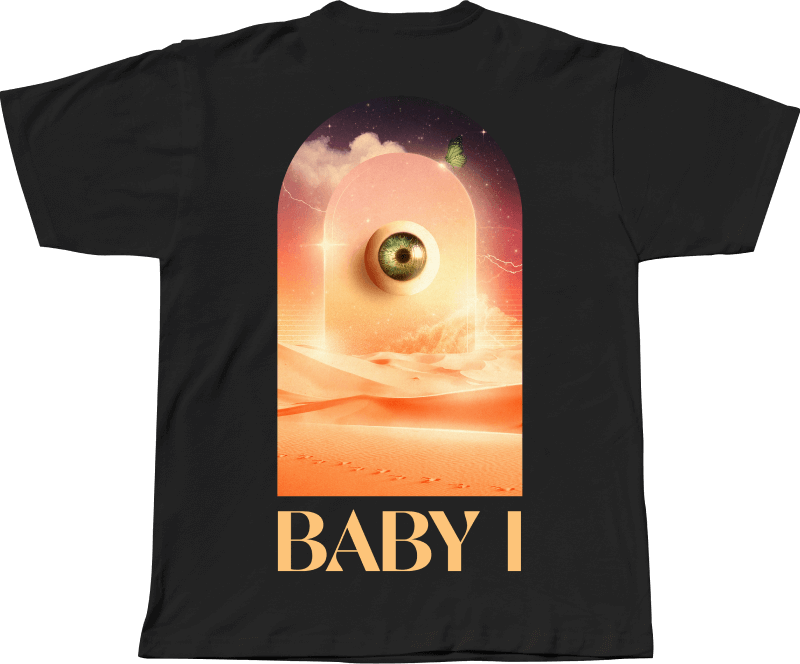
COVERS & ANIMATIONS

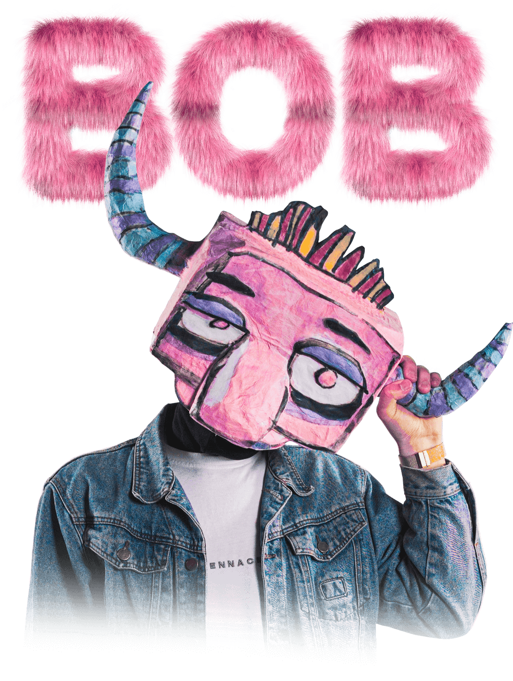
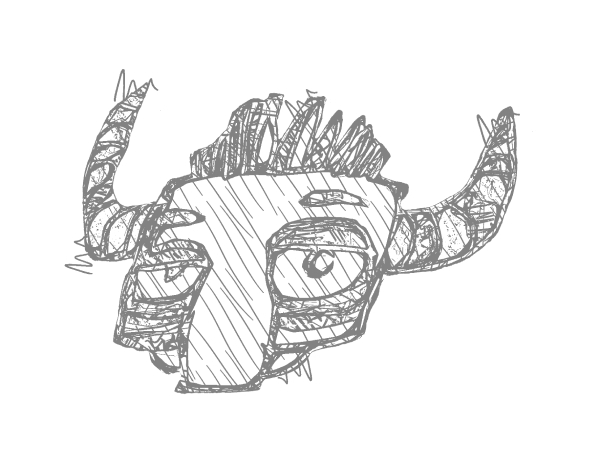
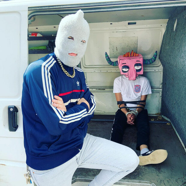
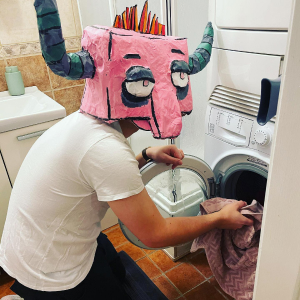
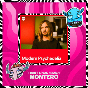
One of the label residents and its creators, indie rock band I Don’t Speak French, is the label’s branding leader. Their initial idea of having a papier-mâché monster head found its perfect reflection in its drawn version, AR-mask and numerous animations used to promote the band’s album, singles and general media.
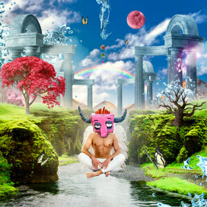
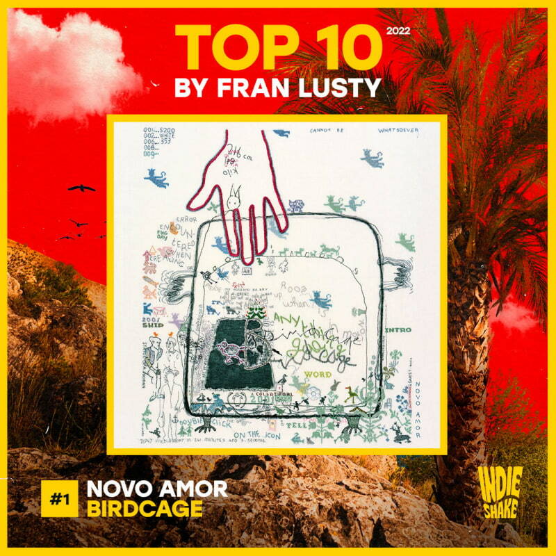
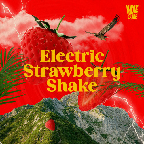
Indieshake’s concept formed the basis for all in-house artworks. Be that a press pic of an artist used for a cover, or an abstract portrait or scene, everything screams with uniqueness and an authentic idea of mixing psychedelic with real. So far, this exact approach helped the label form its recognizability in front of editorials, radio and other crucial management aspects.